Informations générales
Nom à intégrer au logo
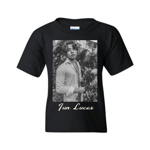
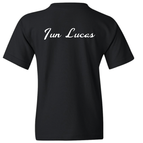
Jun Lucas
Slogan à ajouter au logo
Description de la société et de son public cible
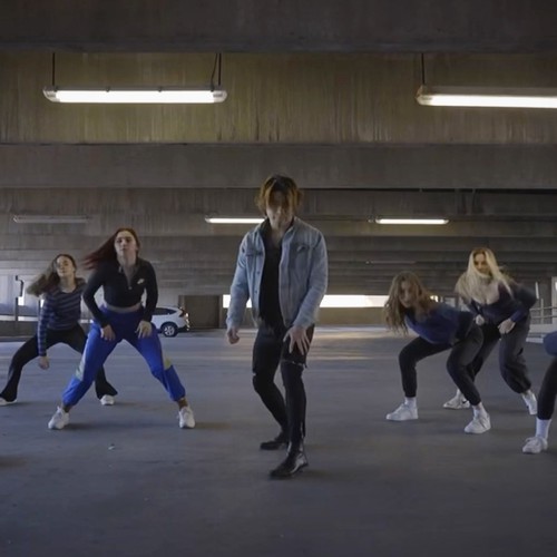
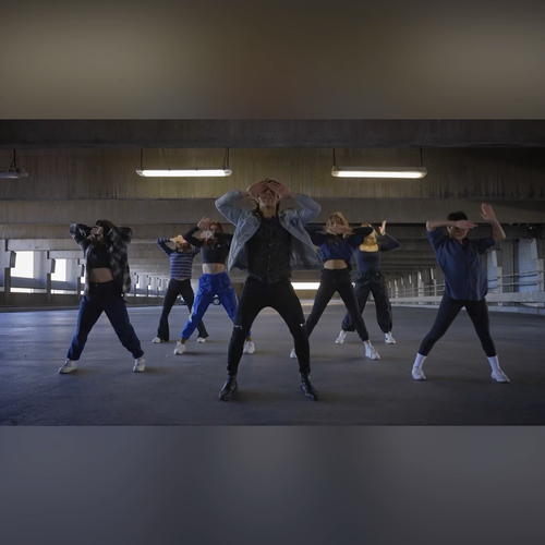
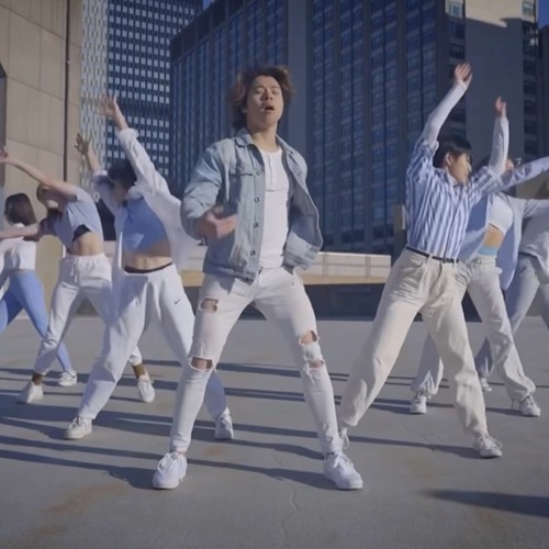
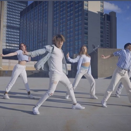
I am a singer, dancer and rapper. I write and perform pop music that’ll be on the billboard hot 100 charts, with r&b, Kpop and electronic influences.
I shoot dance music videos too, sing and rap in them and I want to take my artistry to the next level with strong visuals for my name.
I’m an extremely versatile performer, my target audience is mainly female in their teens to 30s - middle class income.
Secteur d'activité
Arts et divertissements


Références


Autres notes
TAKE NOTE (update): Not compulsory, But I do like the way the letter "J" looks on the T-shirt.
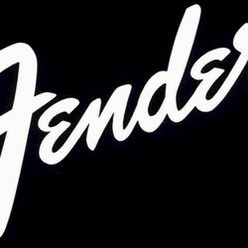
Update 2: The J and L should be significantly bigger than the rest of the letters. Just like you see how the "F" is very big and distinguishable in "Fender". Very dominant First letters.
Update 3: Also, there is some significance to the number 7.
With the “J” and the “L”, I have been pushing designers to hint the “7” it brings out my artist concept more. 7 is completeness and is God’s number, let’s see what we can do with that. Once you re-arrange them, you also get the letter “Z” which stands for Gen Z (and dragon ball Z, my favourite childhood show, that requires “7” dragon balls).
I derive a lot of inspiration from “Fender” the American electric guitar brand - as they are extremely versatile, popular, luxurious and expensive - very pop oriented too and they’re from California.
That’s the vibe I’m trying to nail. Versatile, popular, luxurious, LA vibes but MASCULINE. Emulating the cursiveness of the Fender logo is crucial - script styled font.
The logo should just be the name in a really cool font.
Take a listen to my music to get a better understanding :
Fichiers livrables
1 x Logo
Fichiers finaux
Si vous utilisez des polices qui nécessitent une licence, vérifiez auprès du client qu'il est d'accord. Pour des raisons de licences, il est mieux de fournir au client les informations sur comment acquérir la police plutôt que de fournir les fichiers actuels.
Le texte des logos doit être converti en vecteurs.