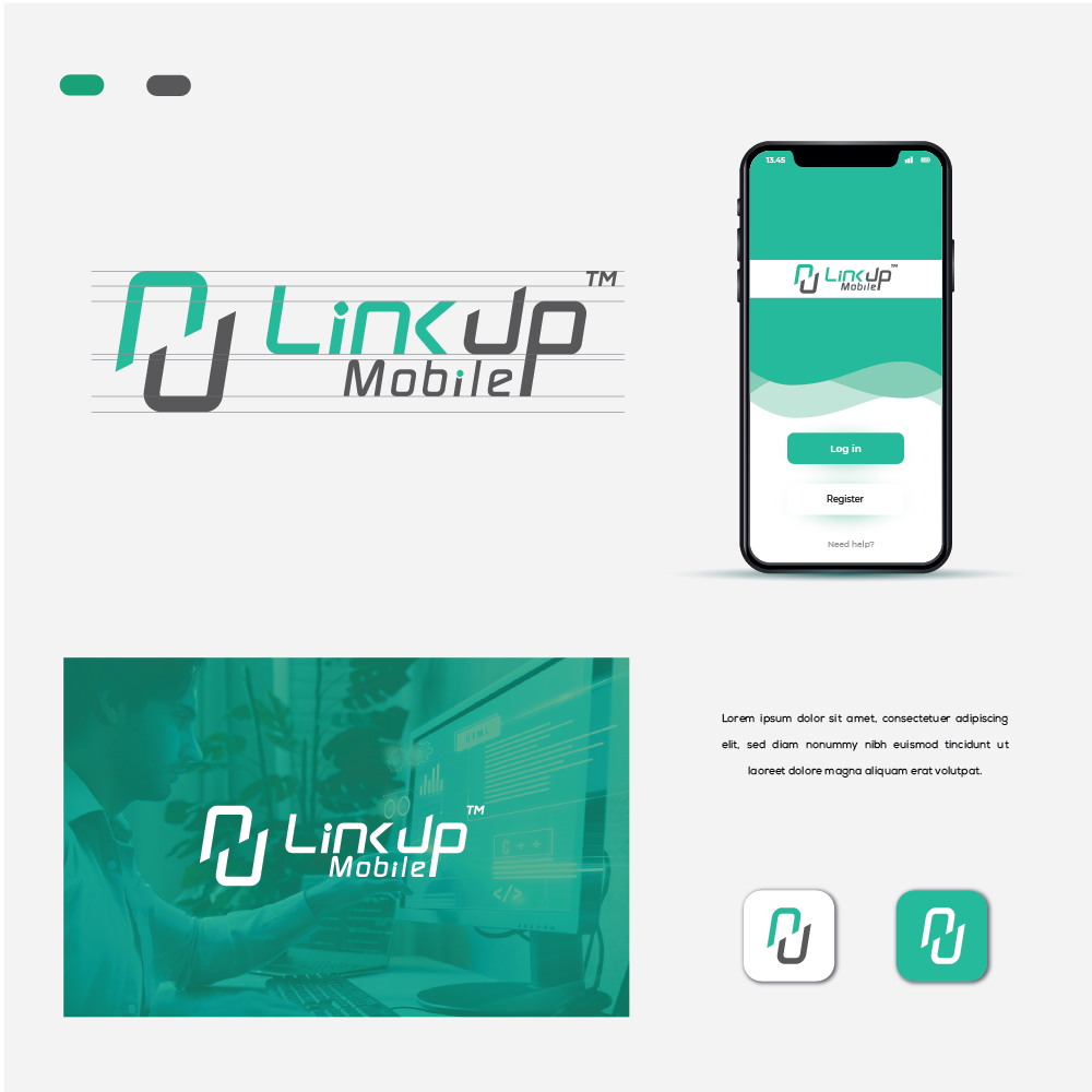

The logo concept of LinkUp Mobile focuses on connectivity, trust, and good relations. Here's the description:
Logo Concept:
The logo features an abstract icon that combines the letters "n" and "u" in a creative and unique way. These two letters form a continuous loop, symbolizing the connection and link between people, which is at the core of LinkUp Mobile's mission.
Color Palette:
The color palette should reflect the qualities you mentioned: cool, soft, energetic, trust, and good relations. Here's a suggested color scheme:
Energetic Green: A vibrant shade of green to represent energy and vitality, symbolizing the dynamic nature of mobile connectivity.
Neutral Gray: Use a neutral gray for the letters "Mobile" to balance the energetic colors. Gray also conveys professionalism and modernity.
Typography:
Customize the typography for the company name "LinkUp Mobile" to give it a modern and sleek appearance. It is an easy-to-read font that complements the logo icon.