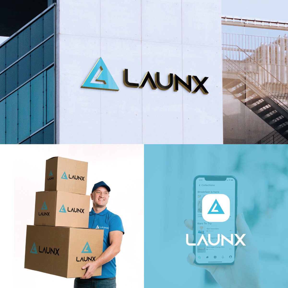

The client wanted change their first logo and wanted an effective logo for their brand. I decided to take the idea triangles from the first logo and make it one triangle that stands out with the letter L in it to create the brandmark for the logo.
I chose the color light blue from the previous logo because it is a calm and soothing color that represents intelligence, responsibility and professionalism. The color blue is cool and relaxing, blue can mean depth and power. It is the most popular color in the world, both in terms of personal preference (for both genders) and in terms of trust and reliability.
The font I used for the logo is the same sans serif font as the previous logo, it fits the shape of the symbol and gives the logo a modern look.