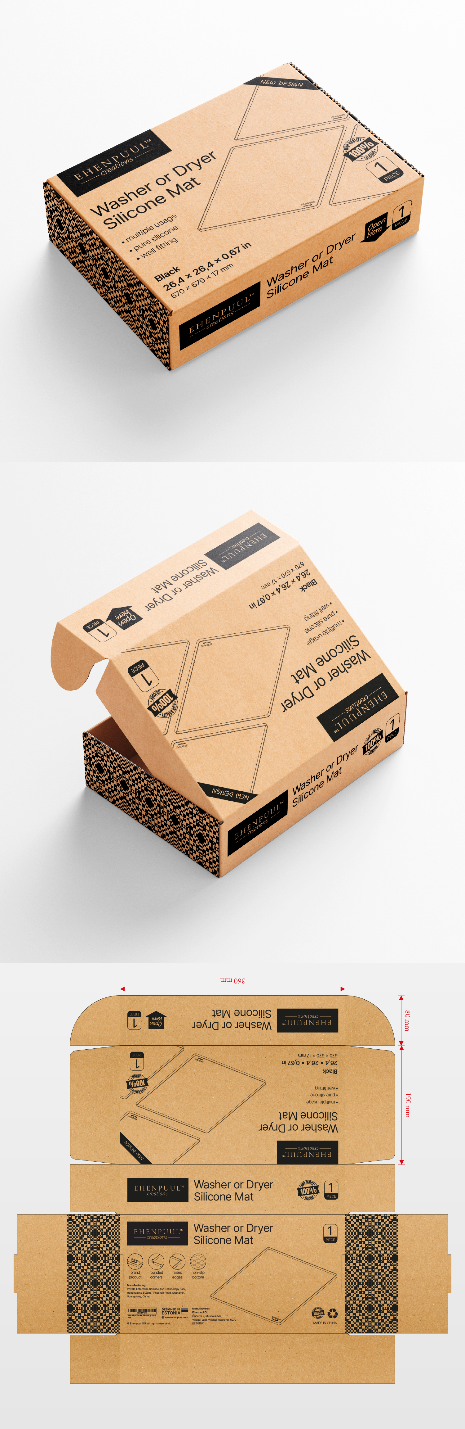

The purpose was clear, to show the customer the benefits of the product and that they need it in their home.
Making the most of the elements that the client had as the key visual of the mat, which would serve us not only to show the product but also to highlight attributes such as "rounded corners" or "brand product", which refer more to a visual aspect, on the other hand we also thought that it was even more important to highlight attributes that are not visible or that the client does not notice until they have the product in their hands, such as "multiple usage" or "well fitting". This concept complemented by a main sans serif that is sober and another handwritten one that is more dynamic, in addition to the decorative patterns on the sides of the packaging give seriousness and a homely nod to the packaging.