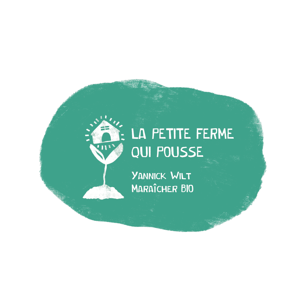
The logo is drawn in a simple, vivid and playful style and I visually translated the name "La petite ferme qui pousse" in a funny way. I made the illustration in Photoshop, but gave it a stamp-like, selfmade look.
I created this variant for an optional one-colour-usage.