Wild Kids Mutli Gummies

0
Créés sur 99designs par Vista
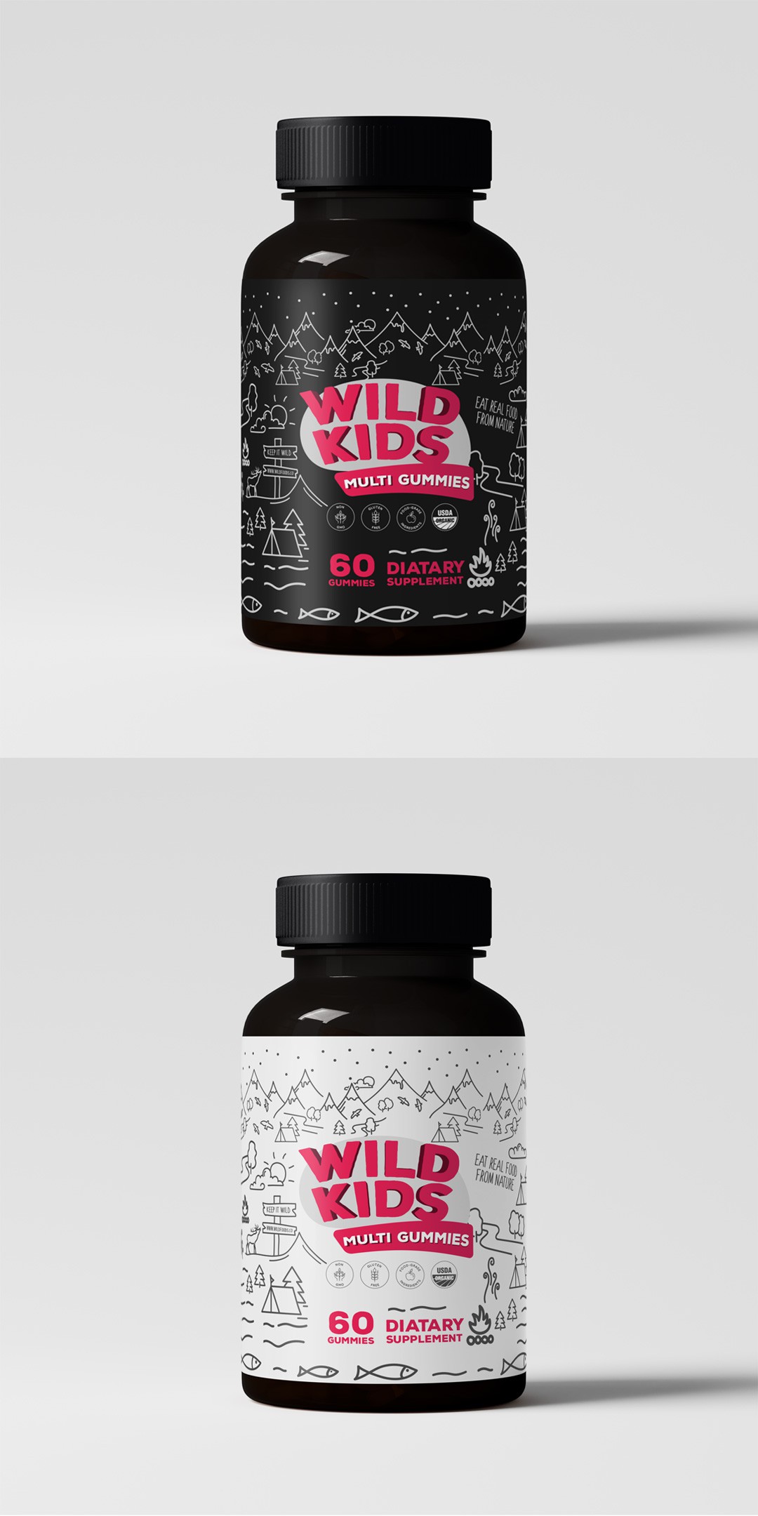
we wanted to keep the fun alive but with a bolder, more eye-catching twist. The playful mountain scenes and doodle-like drawings bring nature to life, reflecting the idea of “wild” in a way that resonates with both kids and parents. We stuck with a clean, minimalistic black-and-white palette to maintain that quiet modernity the brand is known for, but with a pop of bold pink to grab attention.
This design allows the product to stand out in its simplicity, but still feel approachable and adventurous. Whether parents are reaching for the dark or white version, it’s easy to spot, easy to love, and has just the right touch of wild. It’s designed to not just be noticed, but remembered—minimal, playful, and ready for adventure!