Cover design for Healthy Life

1
Créés sur 99designs par Vista
Hello!
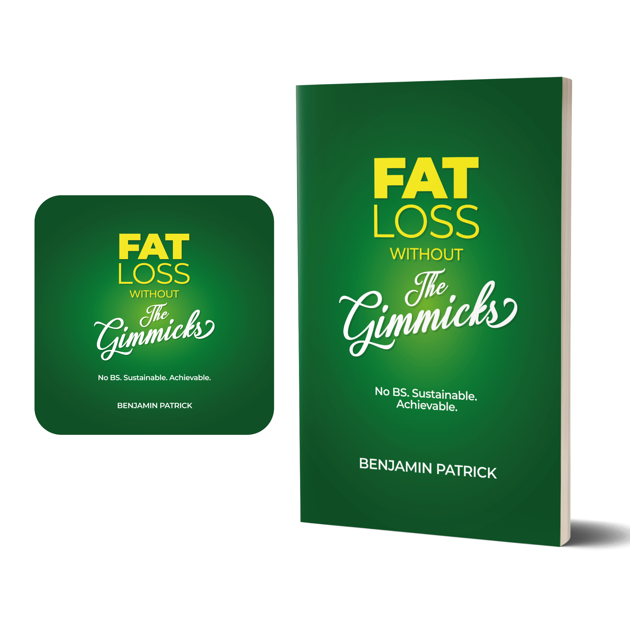
I thought of this design as something direct, typographic and easy to interpret.
I played with bold (fat) and light (loss) fonts for both words and used a magical font for "the gimmicks", which was like the magicians' font, very fancy and in the style of something fantastic.
The color palette alludes to healthy, greens and yellows, giving a hint about the content of the book.
I also added how it would look in the Amazon audiobook shop.
The fonts used are Montserrat black and light and the Losttimoh font (which requires a license) for "the gimmicks".