B.E. Home Interiors

1
Créés sur 99designs par Vista
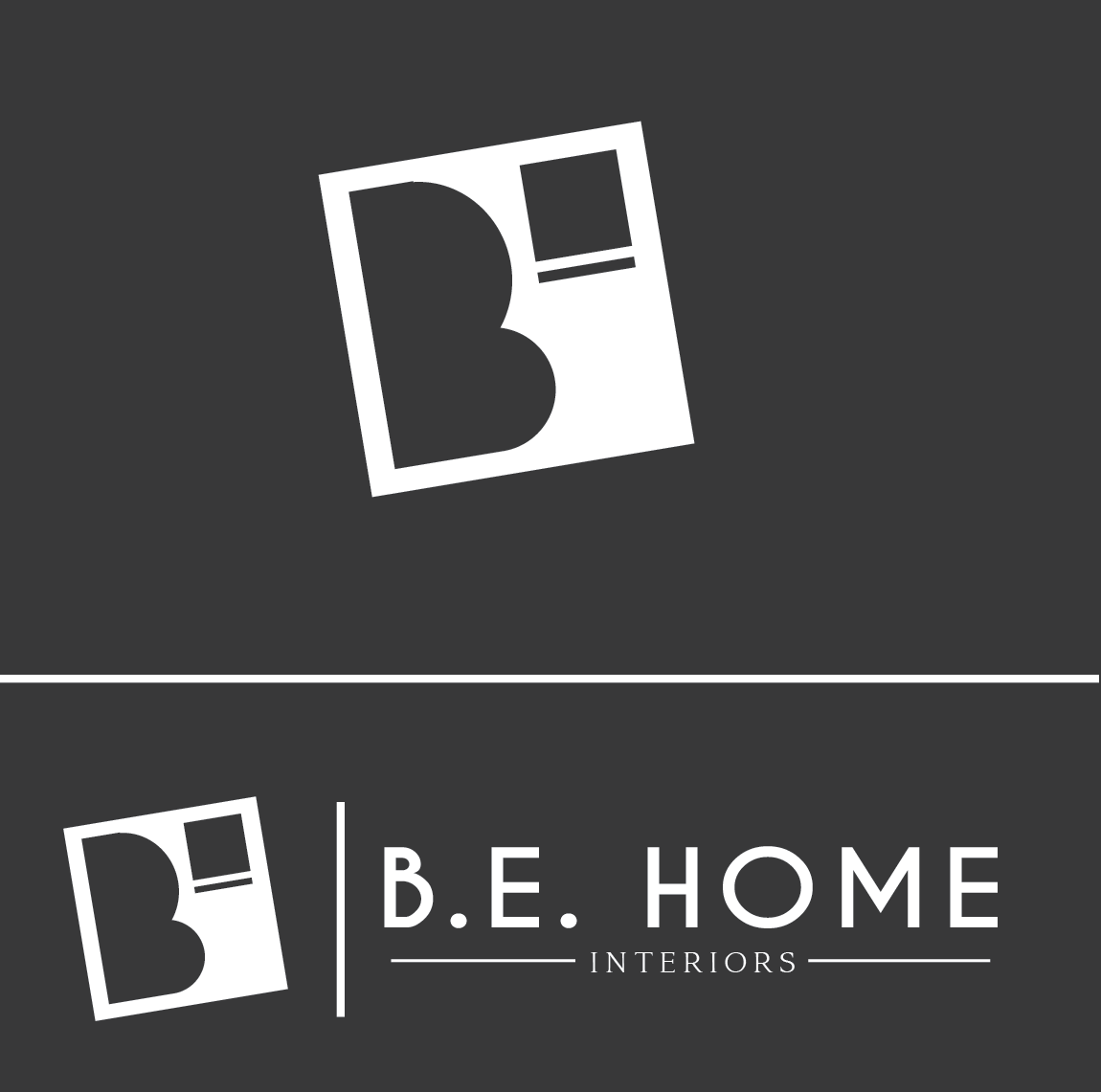
Typically when a designer hears B.E., they focus more on the BE. I wanted to create a logo that would not only stand out but also be eye catching.
The first thing you notice with the logo in the B. That draws your attention in. I added a box in the corner to help with balance as well as to give the appearance of a window.